Why Mobile-Friendly Website Design Matters for B11 Businesses
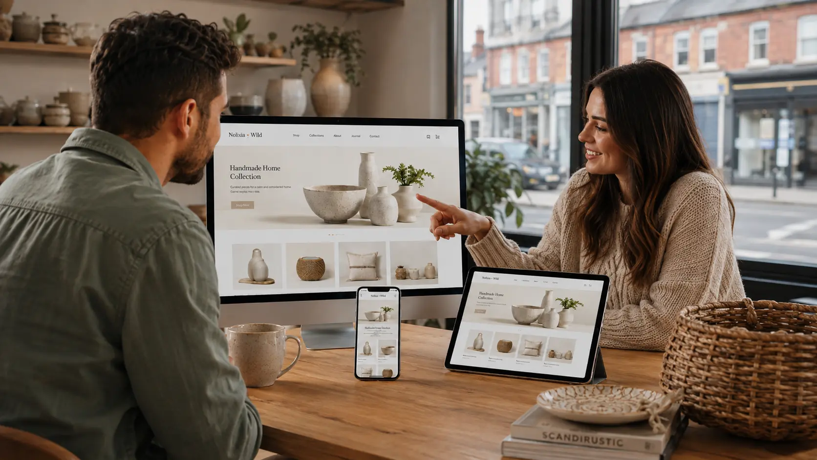
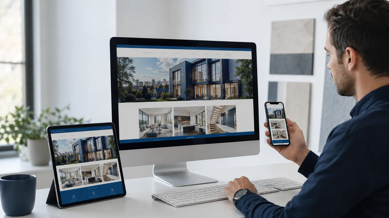
A mobile-friendly website adapts to the screen being used rather than forcing a visitor to zoom or move sideways. For a local business in Birmingham B11, this matters because customers may search while travelling, comparing services or standing near the business.
Responsive design is not only about making the page smaller. It should preserve clarity and make the next action easier.
Keep the most important message visible
The top of a mobile page has limited space. It should quickly identify the service, business and next step. Large decorative sections can push useful information too far down, while crowded menus can make navigation difficult.
Make contact actions easy to tap
Telephone, message, booking and quote buttons need enough space around them. Forms should use clear labels, suitable input fields and only the information required at that stage. Test the complete enquiry route on a real phone.
Optimise images without making them look poor
High-resolution photographs can be compressed and served in modern formats such as WebP. Choose dimensions suitable for the space rather than uploading an enormous image and relying on the browser to shrink it. This supports faster loading while protecting visual quality.
Use readable content
Short paragraphs, descriptive headings and sensible spacing make information easier to scan. Important details should not exist only inside an image because search engines and assistive technologies may not understand them.
Test more than one device size
A layout that works on one phone may fail on another. Check navigation, images, forms and buttons across small phones, larger phones, tablets and desktop screens. Also test slower connections where possible.
See the Luméa Beauty responsive e-commerce project: https://nolixia.com/portfolio/lum-a-beauty-website-design
Read when a B11 business should consider a redesign: https://nolixia.com/blog/website-redesign-b11
Return to our main local web design guide: https://nolixia.com/blog/web-design-sparkhill-b11
Mobile experience supports the whole website
A faster, clearer mobile page can help visitors stay long enough to understand the offer. Performance and usability also create a stronger technical foundation for search, although no single improvement guarantees a ranking.
Read why SEO is important for a business website: https://nolixia.com/blog/why-seo-is-important-for-your-business-website
Explore Nolixia services: https://nolixia.com/services
Discuss a responsive website: https://nolixia.com/contact